We've designed this guide to simplify the complex process of Webflow development. While it doesn't cover every aspect of website building with Webflow, it focuses on customizing the All You Can Eat template. Let's get started!
Step 1: Familiarize Yourself with the Webflow Designer
To make the most of this guide, it's important to understand the basics of the Webflow Designer. The Webflow Designer lets you visually edit your site without coding. You don't need to be an expert to customize a template, but a beginner's understanding is necessary. Familiarize yourself with the different panels, as well as functionalities like adding elements to pages and creating and using classes.
Throughout this guide, we'll share many free resources for further learning. If you're new to Webflow, consider taking the Webflow 101 course at Webflow University before diving into the designer:
For optional deeper learning, Webflow University offers a range of courses and documentation.
These are the top courses we recommend:
CMS and Dynamic Content Course
Interactions and Animations Course
Step 2: Prepare Your Brand Assets
Now that you know your way around the Webflow Designer, you can start preparing to add your brand identity to the template. The basic items you'll need are:
- A logo: Have your logo in a transparent PNG or SVG format, with versions in all the colors you plan to use it in.
- A color palette: Collect the hex codes for all the colors you want to use on the site. We recommend coordinating the existing template colors with the brand colors you want to replace them with.
- Typography: Upload your custom fonts or use the template's fonts.
To upload custom fonts, head to the Site Settings > Fonts section, and follow the directions on the page.
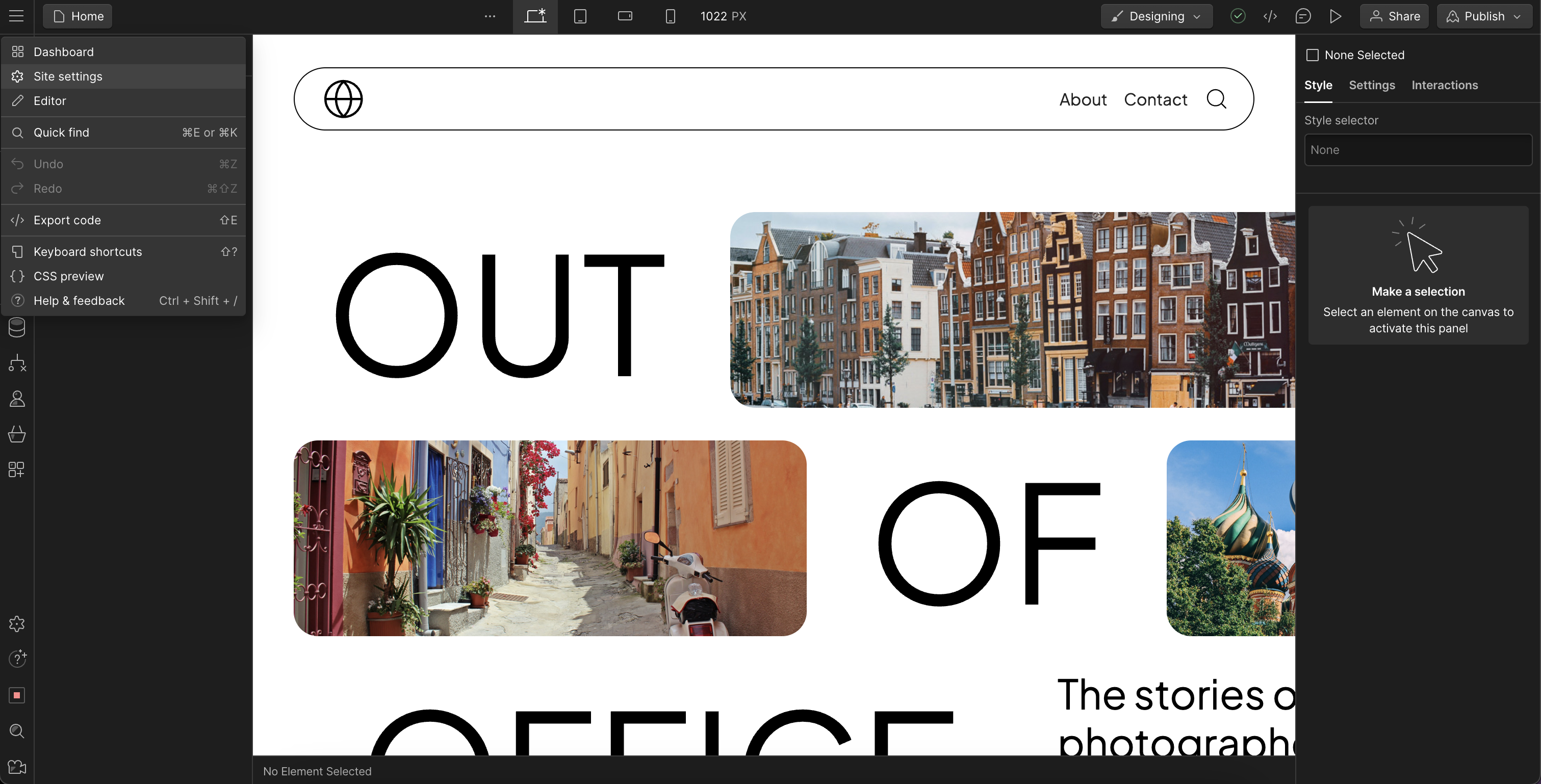
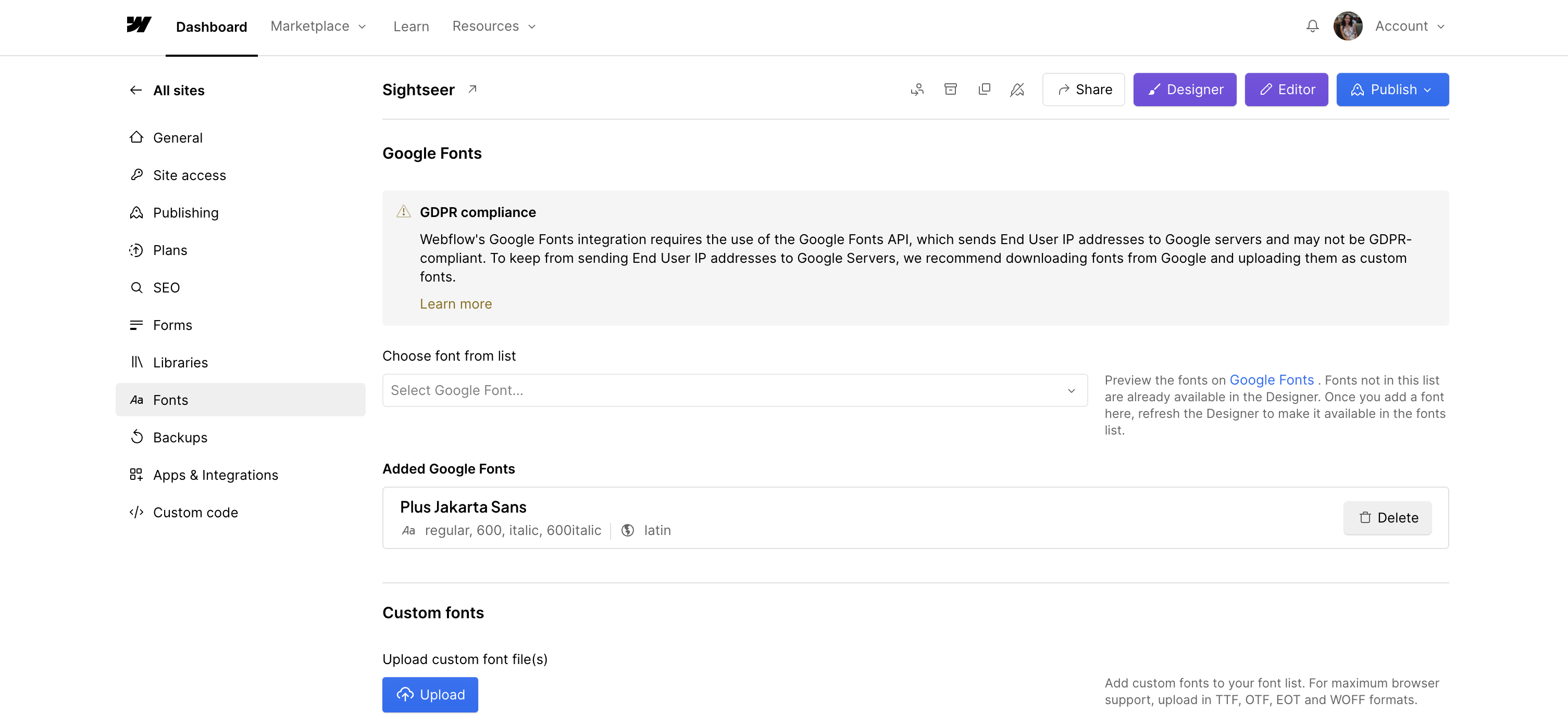
If you are uploading font files, most browsers support the following font formats:
- WOFF (Web Open Font Format)
- TTF (TrueType Font)
- OTF (OpenType Font)
Find a helpful guide from Webflow University here:
For this template, you’ll need to choose fonts for headings, paragraphs, buttons, and navigation. We recommend simplicity, especially for beginners. You can use the same font family throughout the site and vary the styles. For instance, use semi-bold for headings, regular for paragraphs, and regular in all caps for accents, buttons, and navigation.
Step 3: Customize the Design
With brand assets at hand, you're ready to begin customizing the template. The majority of this work happens on the Template Style Guide page. The Template Style Guide organizes the style classes used throughout the template. It allows for quick changes to these classes, with instant effects across the template, as these classes are used consistently throughout the design.
See the Template Style Guide for this template here:
Incorporate your brand's colors and typography by editing the existing classes on this page. We will walk you through how to make these changes in the following sections.
For optional deeper learning about classes and CSS styling, check out these resources by Webflow:
If you are interested in learning more about how we organize our classes and structure our templates, we use a modified version of Client First by Finsweet. Learn about Client First guidelines and strategies here:
Using The Template Style Guide
Access the Template Style Guide page in the Webflow Designer.
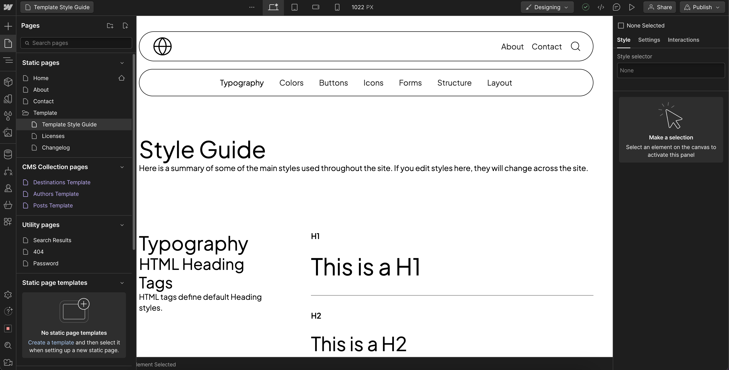
A Note Before We Begin
HTML Tags vs Classes
HTML tags, which are default styles for a particular element type, are pink in the style selector. CSS style classes are blue. Every time you add an element to the page, it will inherit the default styles from its HTML tag. Blue classes are added to override those styles.
For instance, when you add an H1 element to the page, it will inherit the styles from the H1 HTML tag. Once you apply a class to the element, the class styles override the HTML tag styles. We use both of these to style the template, and will be discussing both in this guide.
REM vs PX
This template uses REM as the font-size and spacing unit for better accessibility. The default sizing is 1REM = 16px. To adjust font sizes and spacing, use REM sizes.
Here is a helpful calculator for reference:
Typography
Body HTML Tag (Pink)
Select the Body element, then use the typography section of the style panel on the Body (All Pages) HTML tag to set your typography. We recommend styling this the same as you will for regular paragraphs. The Body (All Pages) HTML tag is inherited by every page in the site. Styling typography on this HTML tag is a fall-back that ensures that any text element added to any page will inherit these styles. This way, if you skip or forget to add a class to a text element, it will still have typography consistent with the rest of your site.
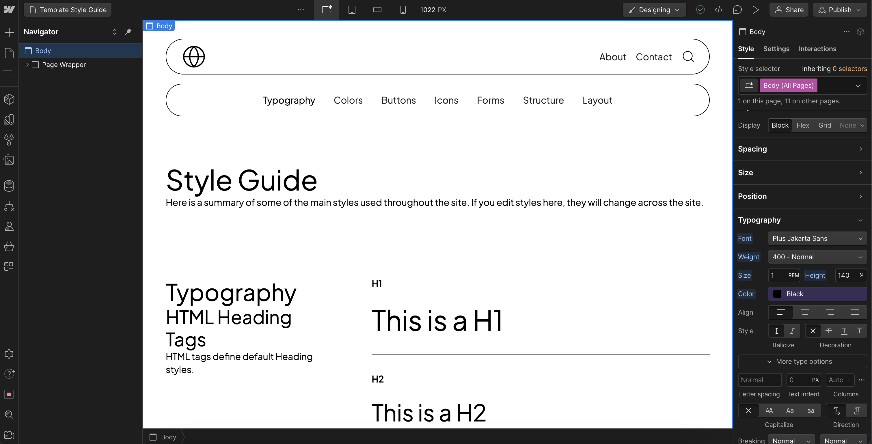
Typography HTML Tags (Pink)
Select the H1 element in the Template Style Guide and style the HTML tag using the style panel. Apply your desired style changes to all elements in the HTML Heading Tags and the Other HTML Tags sections. These include Headings H1- H6, paragraphs, links, quotes, unordered lists, ordered lists, and rich text.

Typography Heading Styles and Text Sizes (Blue)
Next, customize the classes used on the typography elements in the Heading Styles and Text Sizes sections.
Heading Style H1
- Match the Heading Style H1 customizations to the ones done on the All H1 Headings HTML tag.
- Do the same for H2 to H6 with their respective HTML tags.
Text Size Regular
- Match this class to the default All Paragraphs HTML tag.
Other Text Sizes
- Style these accordingly.

These classes are used to override the default HTML tag styling on typography elements.
For instance, you can add an H3 element, which will inherit the styles of the All H3 Headings HTML tag, and apply the Heading Style H1 class to change its appearance while remaining an H3 in HTML. Similarly, you can add a Paragraph element, which will inherit the styles of the All Paragraphs HTML tag, and apply the Text Size Large class to change its appearance.
Color Palette
Now that typography styling is complete, you can move on to the site colors. This template utilizes color variables, simplifying site-wide color updates.
Access the variables panel to incorporate your color palette. Review the template’s existing colors and identify which of your brand colors will replace them. Update the existing color variables with your selections, or establish new variables to match your brand colors.

Back on the Template Style Guide, in the Background Color section, customize the classes for background colors using the color variables. If you've updated existing color variables, the changes will already be reflected here. If you've created new color variables, you can select them from the color picker in the style panel. Keeping the labels in the Template Style Guide and the names of the classes correctly defined will help you stay organized and make them easy to identify.
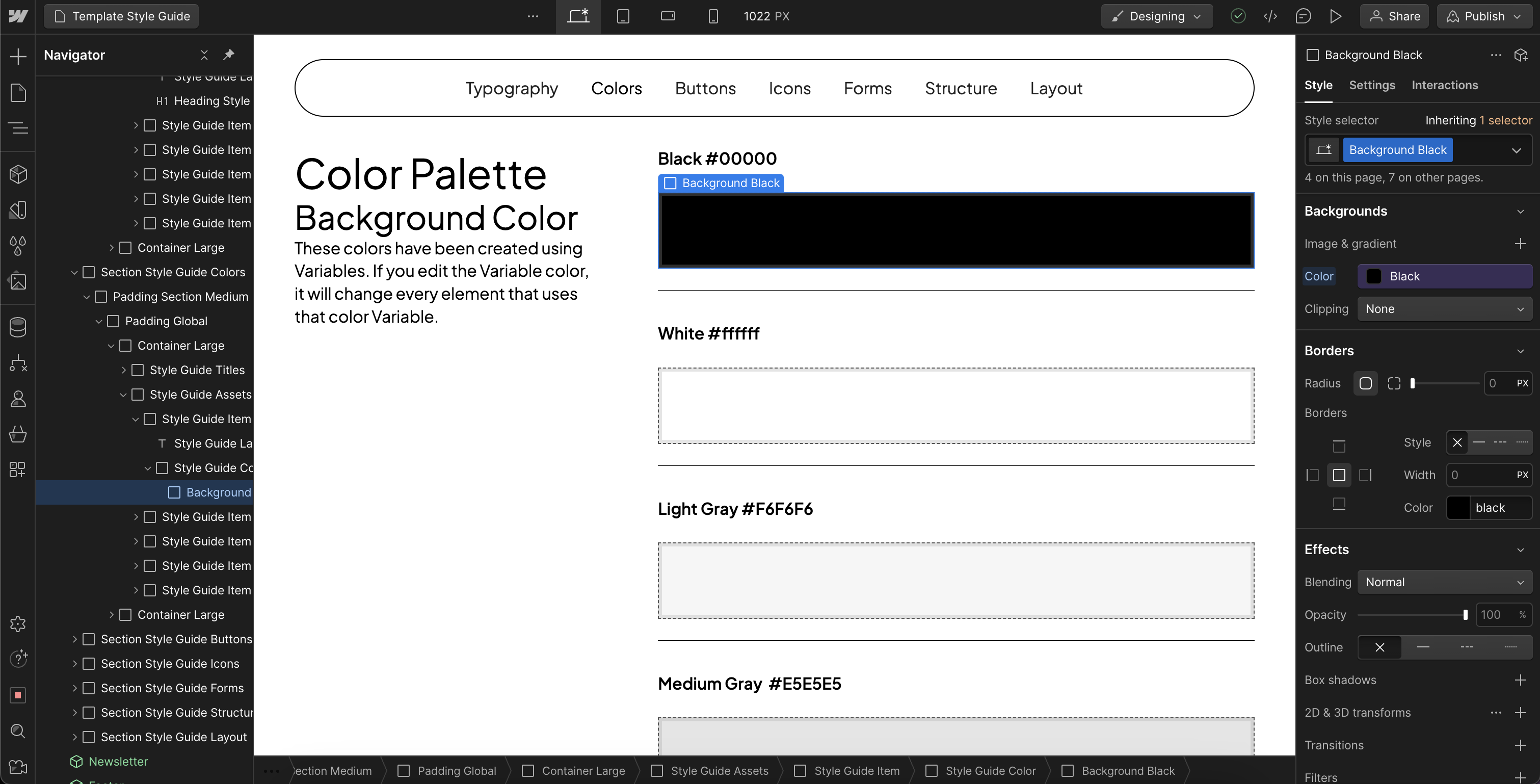
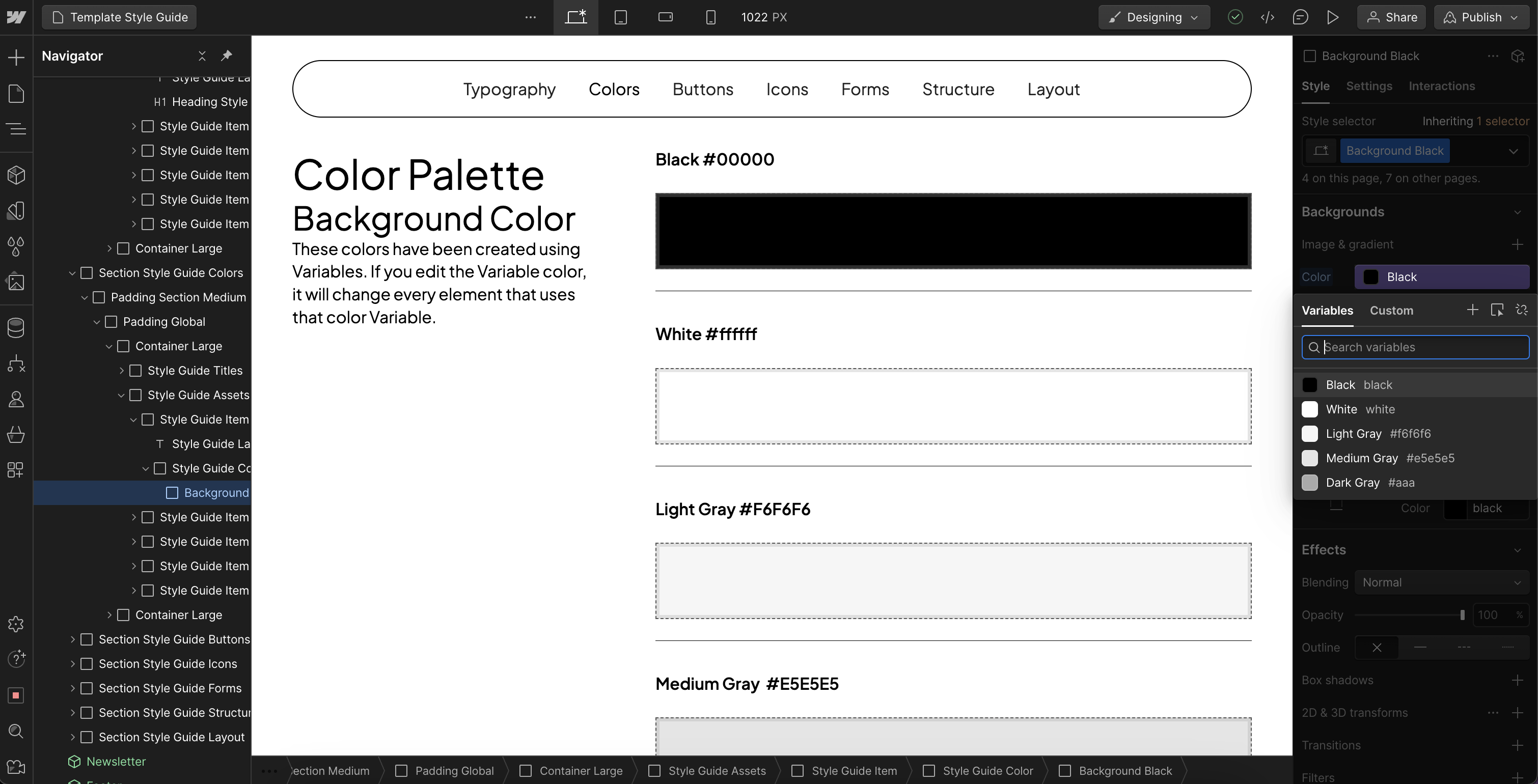
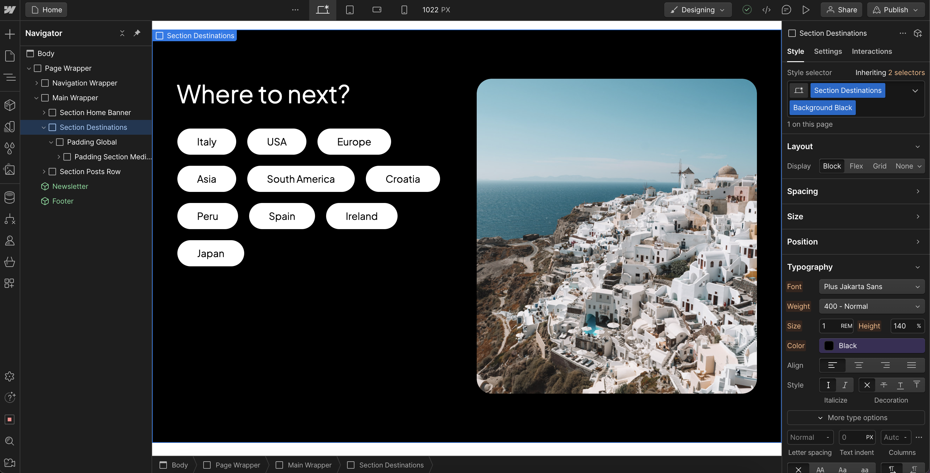
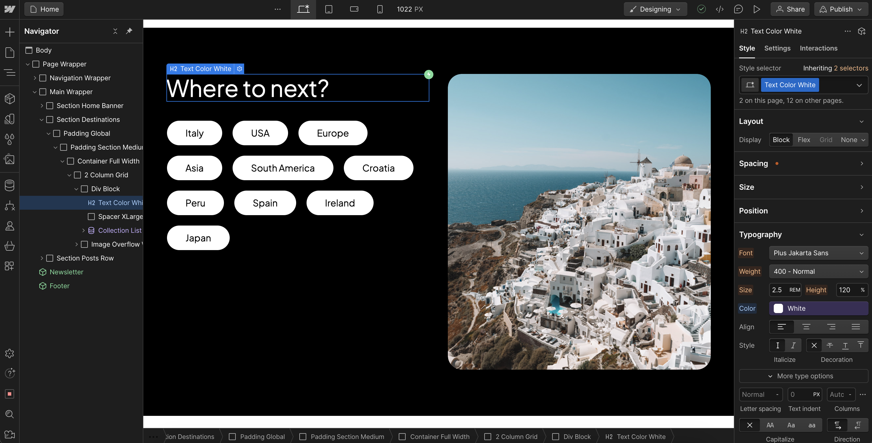
Apply your desired changes to all the elements in the Background Color and Text Color sections, adding new ones if needed. These classes define the colors used throughout the template. To change the color of an element, remove the current class and add the desired one in its place.
Below are screenshots demonstrating these classes used as a background color for a section and as a text color for a heading.
Buttons
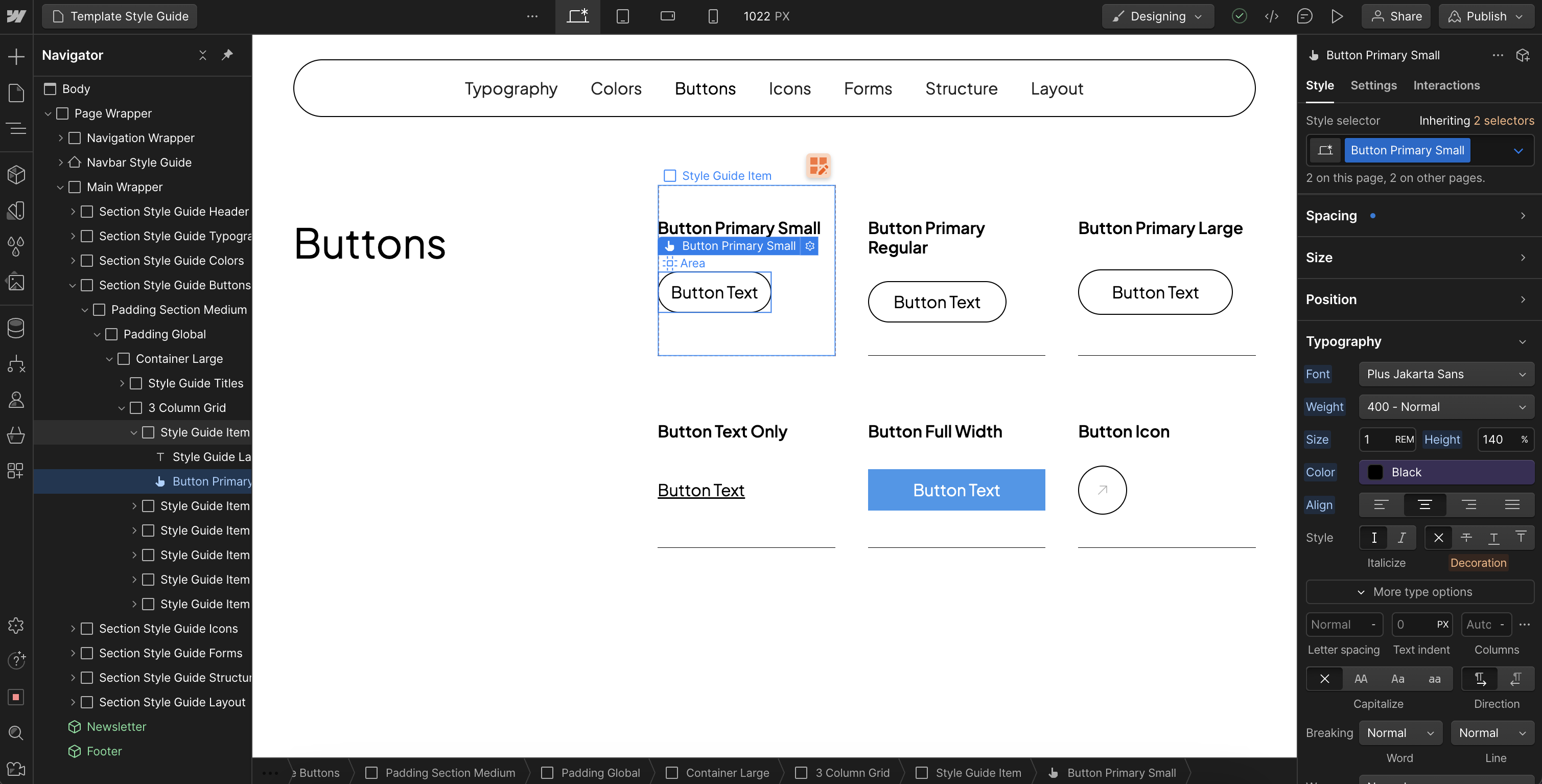
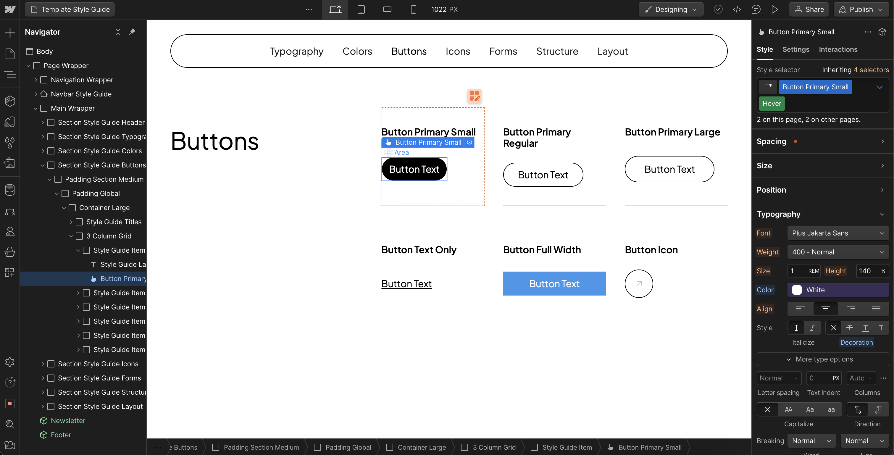
In the Buttons section, we have included three different sizes for each button color. While we only used size large in this template, the other sizes are available for you to use. Adjust the spacing, colors, and font choices for both the default and hover states of each button. You can also duplicate these and create new classes if you are looking for more button color options.
To maintain organization and clarity, be sure that the labels in the Template Style Guide and the class names are accurately defined.
Icons
All icons in the template are image elements with one of the classes from this section applied to it. The classes in this section only control the size of the icons. If you wish to adjust the sizes, you can do so here. Otherwise, there is not much to change in this section. To change the icon, you will need to change the image uploaded to the image element.
For consistent icon styles, the icons used in this template are sourced from Phosphor Icons in the light weight. You can source other icons you need directly from them at:
Forms
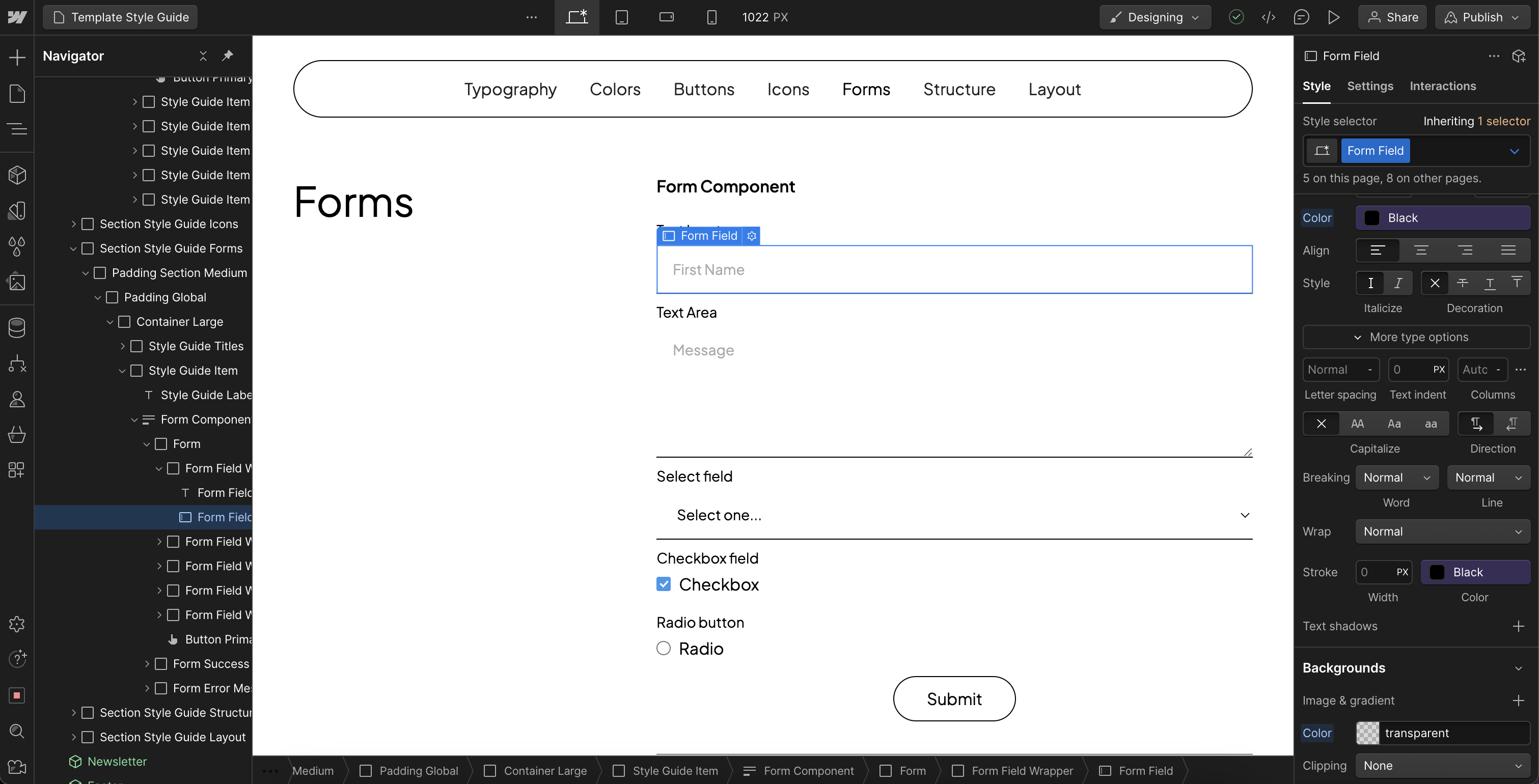
In the Forms section, you can customize the style of all form element classes. This includes the form block, label, text input, text area, dropdown select, checkbox, and radio button. If you make changes to these classes, be sure to adjust the focused and placeholder states as well.
Structure and Layout
Unless you have an advanced understanding of Webflow, we do not recommend making changes in this section. These classes are used site-wide as the foundation of the template.
Most of these classes utilize size variables from the variables panel. Adjustments made to these variables will apply to the existing classes used in the site structure.
Size Variables In This Template
- Corner Rounding
- Page Padding Desktop
- Page Padding Tablet
- Page Padding Mobile
- Gutters

Spacers
We do not recommend modifying these spacer classes. Keep them for reference when needed. Spacer classes are used on empty divs between elements to ensure consistent content spacing throughout the template.
Step 4: Customize the Content
With the template customized for your brand identity, you can now personalize the site content with your text and images.
While most of this process is straightforward, we've included some important clarifications just in case. Navigating through the navigator panel and viewing the style and settings panels on each element and class will help you understand their construction and usage.
Changing The Logo
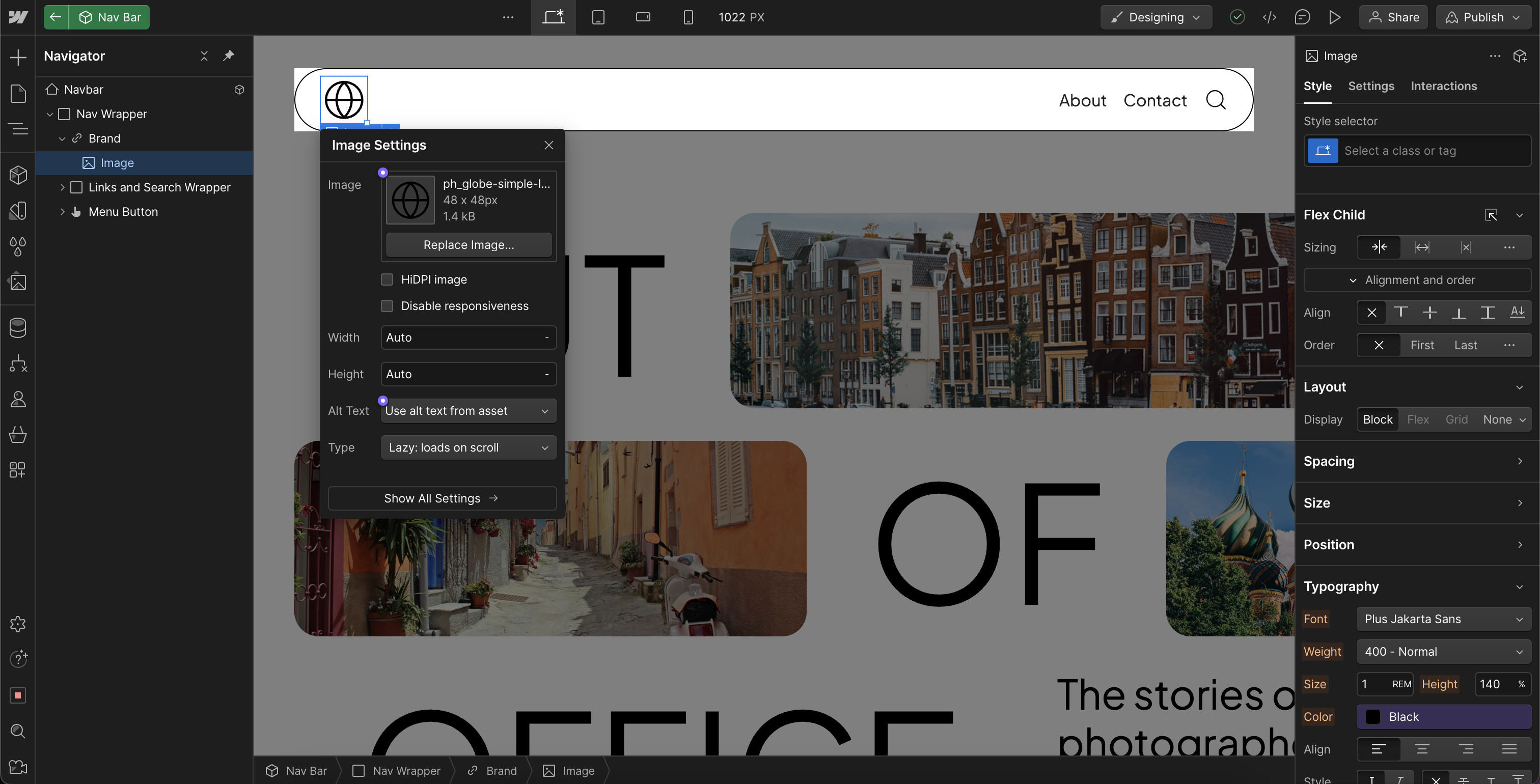
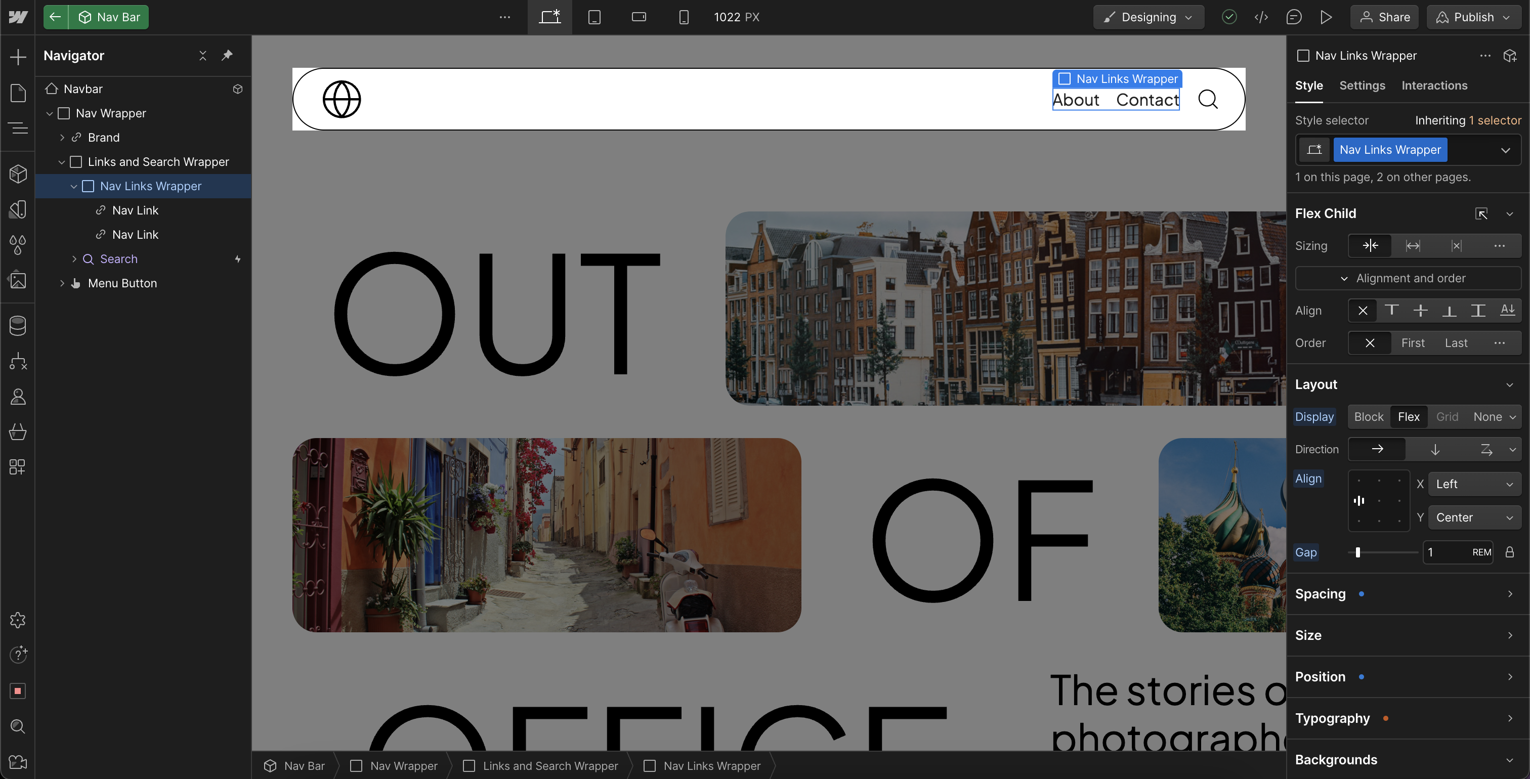
The logo is an image within a link block. Replace the image file of the template logo with your brand's logo. Depending on your logo's dimensions, you can adjust its size to optimize its appearance. The areas where you can change the logo in this template include the Nav Bar component, Footer component, and the 404 page.
Navigation
The Navbar component is utilized on every page. As a component, changes need to be made only once, and they will be applied wherever the component is used. You can edit the existing Nav Link and add more in the Nav Link Wrapper.
Changing Icon Colors
Icons in this template are sourced from Phosphor in the light weight. If you need to change an icon's color, download the icon in SVG format from their site. Use Figma or Illustrator to set the color, then upload and replace the icon in the template with your version.
Changing Images
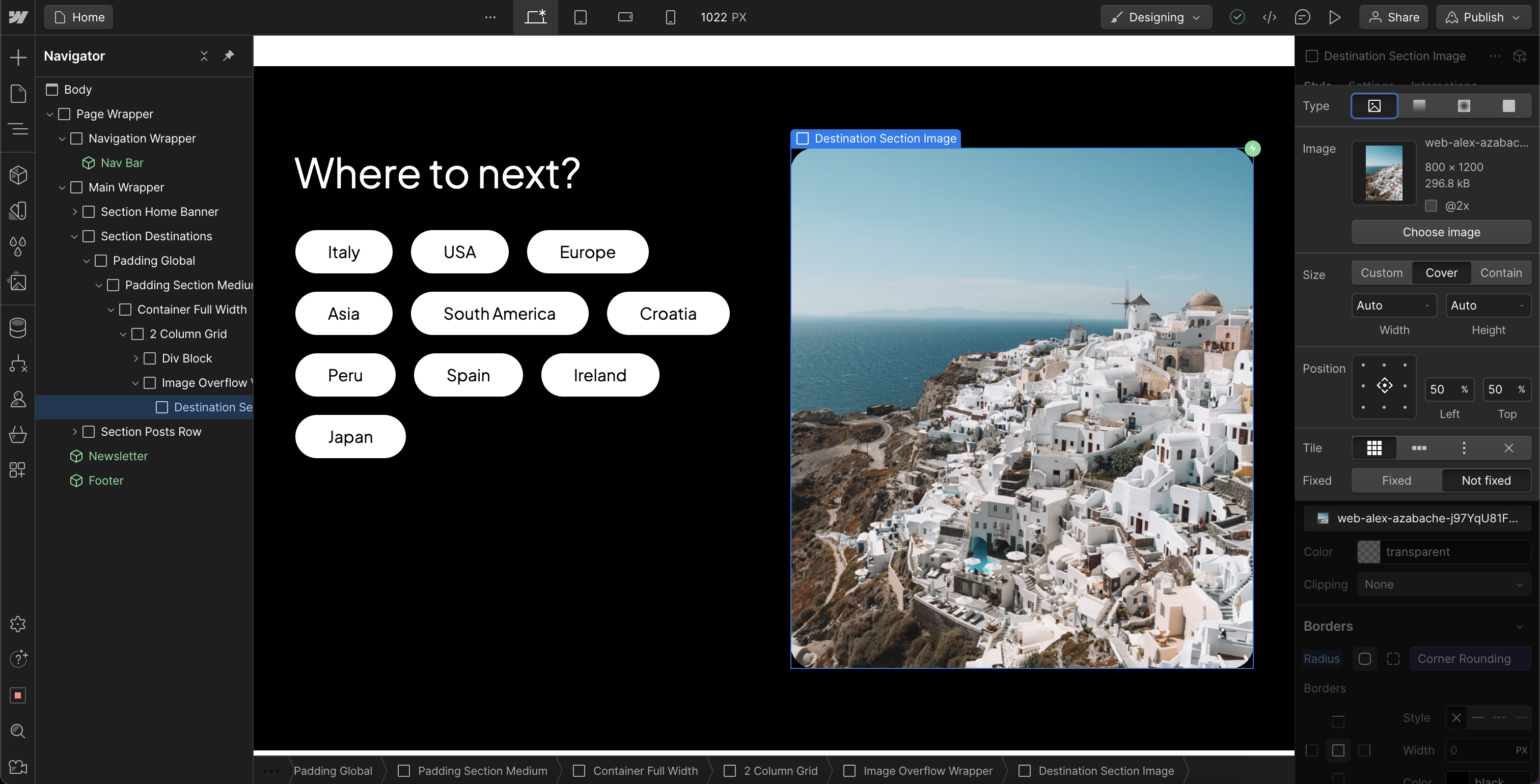
In most cases, we use a div element with an image uploaded to the background image property instead of an image element. This approach allows us to control the size ratio of the image through the div, rather than the image's uploaded ratio. This method ensures the image will crop and adjust to cover the size of the div, regardless of the image file's ratio.
Removing Sections
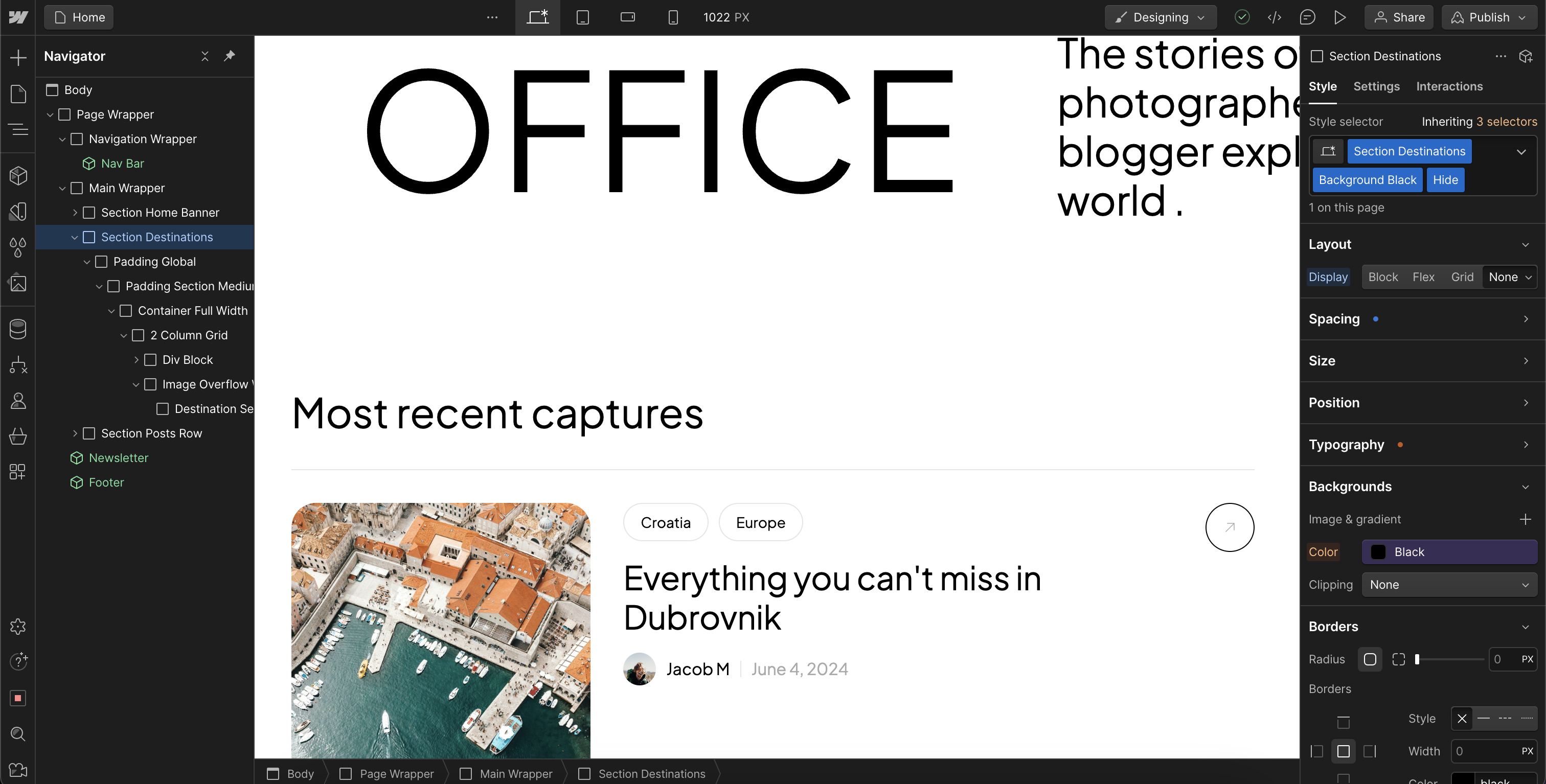
To remove a section, we recommend adding a class with the display set to hide instead of deleting the section. This way, the section remains available if you decide to use it in the future.
CMS And Dynamic Content
We recommend refraining from deleting existing CMS items until you're ready to launch. Keeping these items can serve as a guide to understand where each element will be used and displayed in collection lists and CMS collection pages.
Note:
Certain elements linked to CMS items are configured with filters and conditions. You'll become familiar with these as you customize the template.
For instance, the posts in the collection list on the Destinations Template page are filtered to only display posts that are the current destination.

For optional deeper learning about Webflow CMS and Dynamic Content, check out these resources by Webflow:
Animations
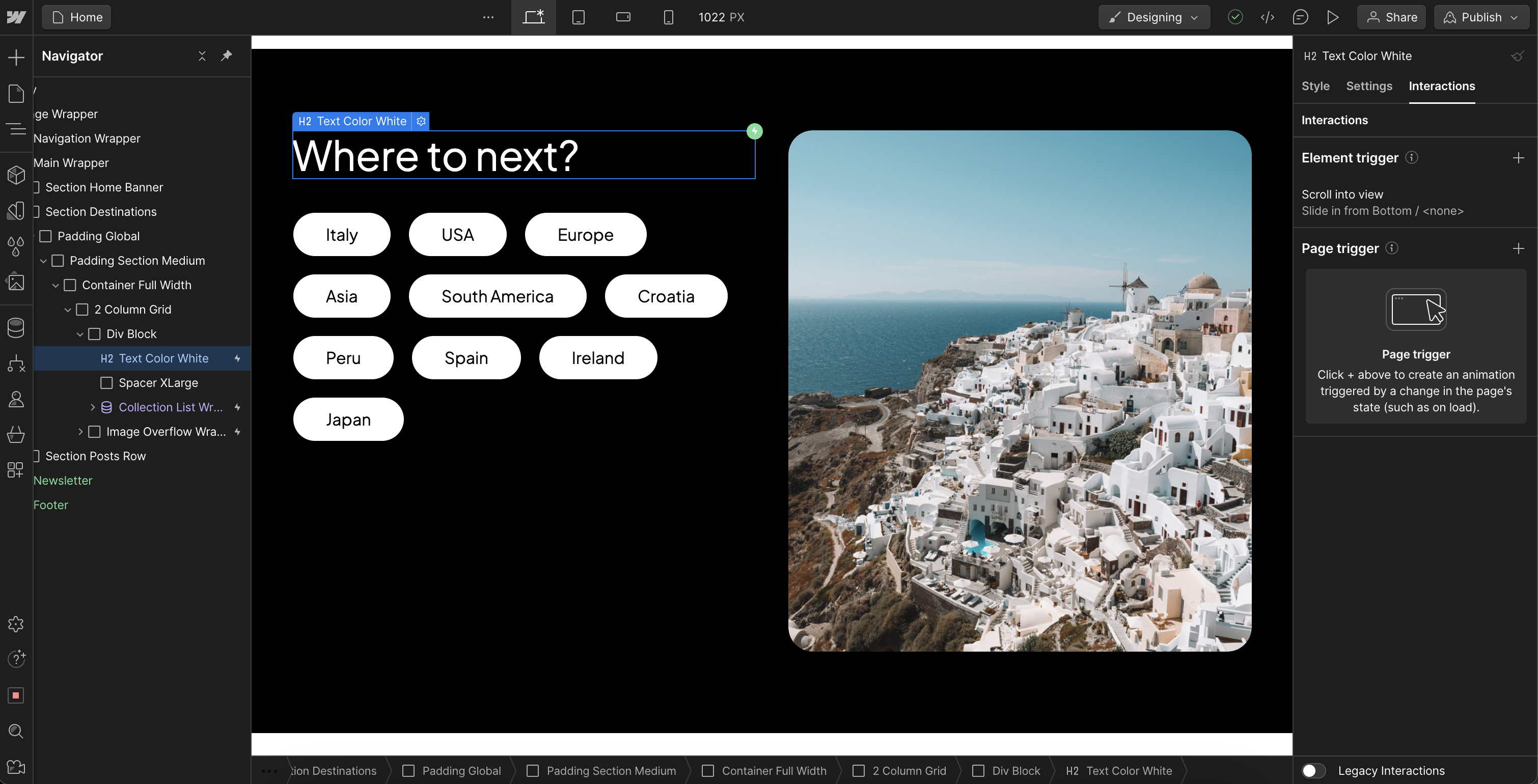
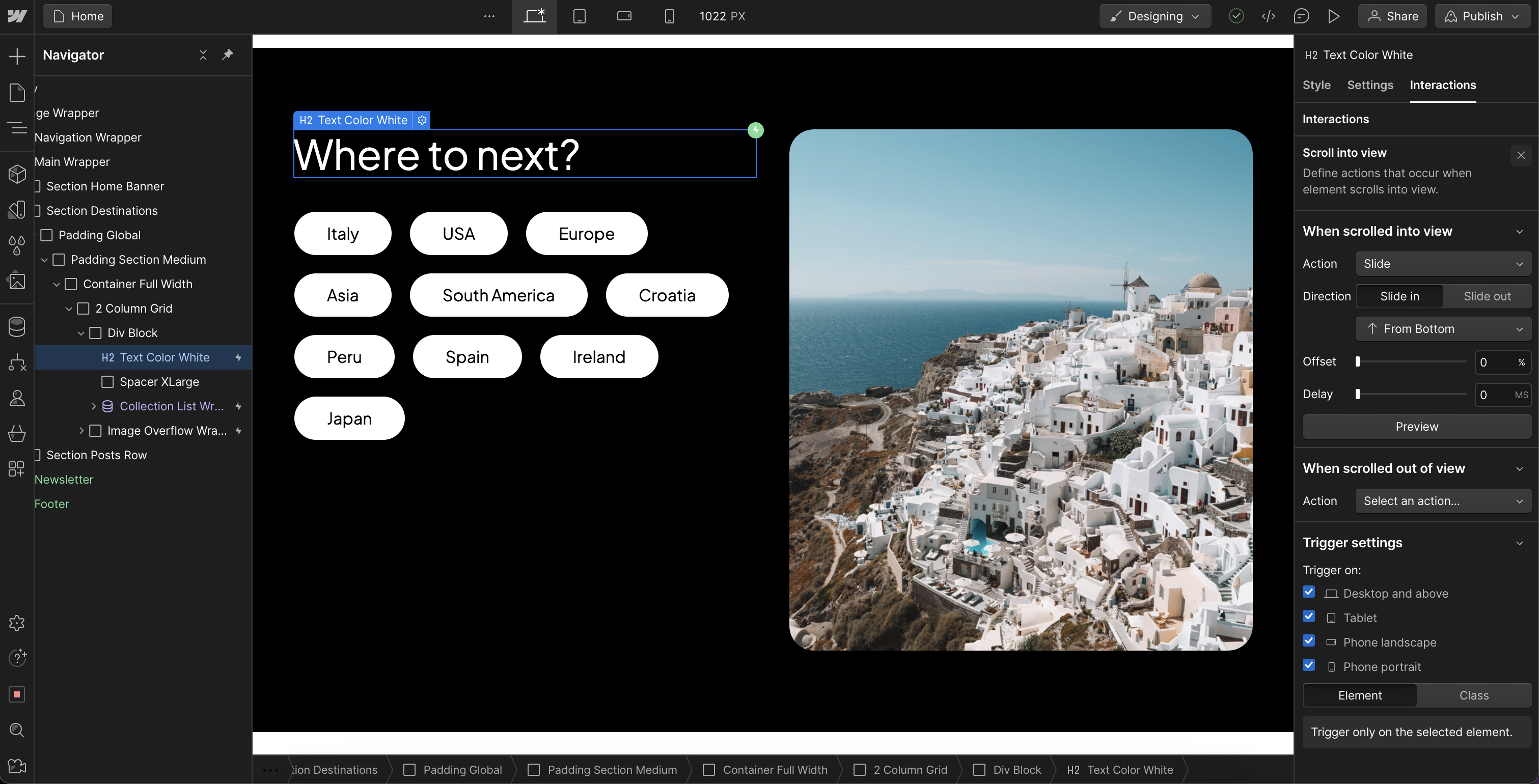
We keep our animations simple to ensure they are easy for beginners to understand and modify. The primary animation we use is the Slide In from Bottom animation, which can be set in the interaction panel.
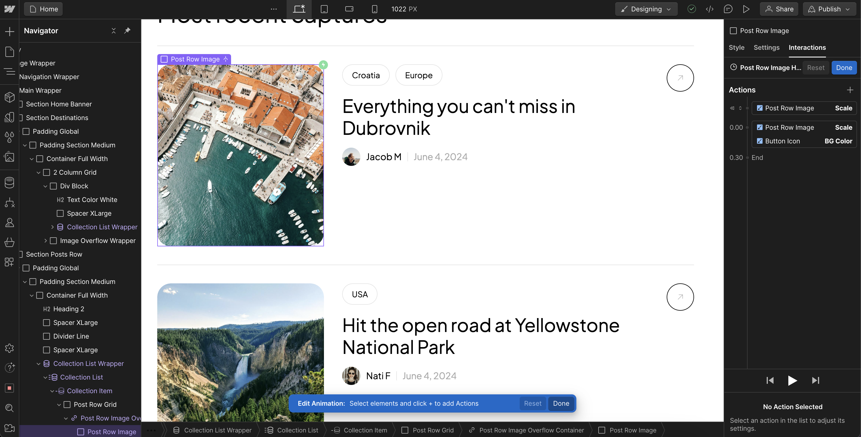
The posts in the grid and row displays also have unique hover animations. They are made to be easy to understand once analyzed. They have an image zoom effect and an icon button color change effect on hover over the image.
For optional deeper learning about animations, check out this course by Webflow:
Interactions and Animations Course
Conclusion
We hope this guide has been helpful. If you have questions, feedback, or want to share the sites you create, please send us an email. We’d love to see the work you create using our templates.

